Anthony Callari G324
Monday, 17 October 2011
Death Race 2 teaser trailer
This trailer is a sequel from Death Race so the audience already know what the film is about and the main characteristics. The Trailer starts off with showing the production company which is Universal. This typical of most trailer as the production use it for publicity. The Trailer is approximately 1.03 long which is about average for teaser trailers.
From the very beginning it starts off with a voice over which gives the audience a sense of what its about, the location and who's in it. They have used dialogue from parts of the film to give an idea of what its about for example "every car will hold as many guns and ammunition as it can", this shows that the film is brutal and action packed. Another example is when they say "if the prisoner wins five races he wins his freedom", this also tells the audience the basic plot of the film. The voice over also states some some of the films that the film maker has already made, this will allow the audience to recognise some of the films which they may have seen and enjoyed. The voice over also tells the audience information such as the film name and when it is being released. They have also used backing track to make it more exciting for the audience.
They have edited the clips together quickly rather than just have one scene which is what "super 8" did. This is more common with action films as it gets the audience intrigued and it allows them to see different parts of the film. The more parts of the film that are shown shows the audience that there is a lot of action involved which is what they want. The clips include all the main actors which allow the audience to see who is starring in it. They have used a variety of shots during the teaser trailer so that it appeals to the audience. Using lots of different shots makes it more interesting as well.
Friday, 8 April 2011
Evaluation Activity 4 - How did you use new technologies in the construction and research, planning and evaluation stages?
Youtube
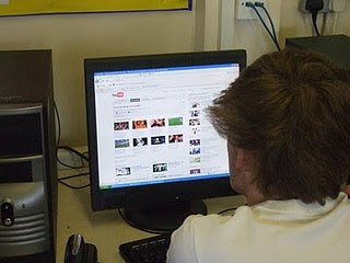
YouTube has been very helpful for us when we were needing to research other trailers. It has the vast majority of all films which has enabled to gather the information needed. The problems we encounted with the software was that at school it was very slow and time consuming. This may not be YouTube's fault but in fact the school connection. Overall we were happy while using this software.
Camera and Tripod
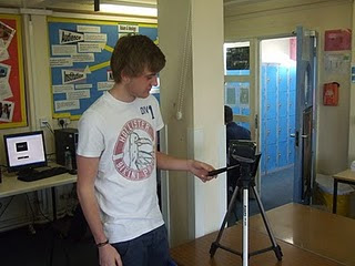
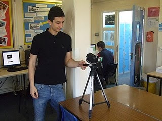
The camera and tripod have been very useful. The video camera has allowed us to film in a high degree of quality to make our teaser trailer look more realistic and authentic. The tripod allowed us to film still images which improved the different shots in our teaser trailer. We also used a microphone to help intensify our sound and therefore improve the diagetic sound especially. The only problem we had with the tripod was that when we went out filming one time it was in fact broken so we found it difficult to film fixed shots.
Blogger
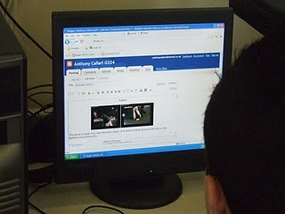
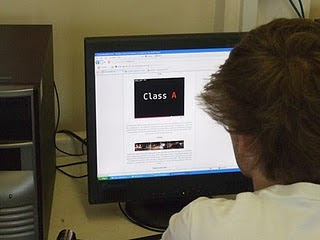
Blogger has allowed us to record all of our work this year including our planning and research, teaser trailer, ancillery tasks and our evaluation. It makes it clear and easy to access. It is also very simple to use. Blogger has helped us gather all our research and then therefore we have been able to put this into our trailer, magazine and film poster. The positives for using blogger must be that it is very easy to find the research we have found and made. Some problems that we have come across while using are that is very easy to forgot to post things you have learnt and found out. Also from time to time it doesn't necessary work at home.
Evaluation Activity 3 - What have you learned from your audience feedback?
From our class mates feedback we thought there were quite a few positives while also being s couple of negatives
Positives:
- Editing was smooth and continuous throughout
- Starts off slow then speeds up near the end
- Film poster was simple but effective
- Magazine links in with genre of the film
Negatives:
- Possibly had a couple more locations to add the gangster effect
- Background lighting for the magazine front cover
- Some of the diagetic sound doesnt quite fit together
We feel all these criticisms are fair and we have taken them on board.
Evaluation Activity 2 - How effective is the combination of your main product and ancillary texts?
We are pleased with our final three tasks as they have all linked well with each other. We have tried to used similar font throughout because we felt it would give it a good effect and will make each tasks link together.From the dark colours used in our teaser trailer we have attempted to use the same colour again throughout. This is because the colours all link with our teenage crime/black cinema genre. Although the film poster is quite basic and lacks information, from our research we found that most film posters are quite basic so that it gets the audience thinking and talking about the film.
I feel that with our final teaser trailer we have come along greatly from our preliminary task. I feel that footage is a lot clearer and we have been able to use many different effects that we weren't aware of when creating our preliminary task. For example we used a simple fade during the trailer which i feel has been very effective. We have also used a time elapse in parts of the trailer, this was because some scenes needed to be speeded up to keep the pace of trailer high. We also feel all our shots are a lot more steady which makes the whole teaser trailer more professional.Various shot types were used throughout to make it more effective and more appealing to the audience.
Thursday, 7 April 2011
Evaluation Activity 1 - In what ways does your media product use, develop or challenge forms and conventions of real media products?
Title font and styles

Storyline

We decided to start the trailer slow and speed it up as it went on. We wanted to do this as this is a typical convention of a teaser trailer and it also helps to build tension and excitement. The first scene is the buyers entering the car park to get the drugs. The camera then shows the dealers. Through the use of camerwork it is clear who are the buyers and who are the dealers in this scene without the need for any dialogue. The pace of the teaser trailer then picks up after the dealer punches the buyer. This is then follwed by the car chase scene, where we use fast paced editing to excite the audience. This is then followed by the tirle of the film, then a montage of one of the actors in his car. During all the scenes the backing trck is playing which again helps to build tension and excitement for the audience which will hopefully entice them to watch the film.
Genre
 The genre is made very clear from the outset. It is clear it will be an action film due to the fighting scene followed by a car chase scene. Our teaser trailer could be classified as a hybrig genre as there are features of the action genre (fighting scene, car chase) and it could also be clssified as the gangster genre. This however is made clear due to the mise-en-scene especially (costumes, lighting, location). We felt it was crucial to establish the genre clearly as we want the audience to be aware of what the film is about before they go and see it.
Editing

These three shots represent continuity editing. We wanted to film the car chase from different angles and then edit it together to craete realism at a high pace. This is often done in a action teaser trailer where car chases are used. this fast paced editing helps to create tension and excitement for the audience. All of the shots were filmed from a fairly long distance, so that the audience can get a full viw of what is going on. We also chose to use fast paced editing as this is a common feature of most teaser trailers where montages are commonly used to create excitemnet towards the film.
Costume
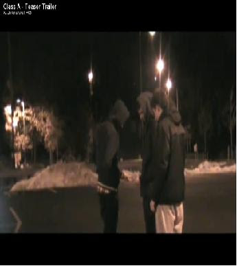 We spent a lot of time thinking about costume for our actors as we thought this part of the mise-en-scene was crucial in oder to create a sense of realism and familiarity for the audience to relate to. We decided on using typical teenage gangster clothing which in modern society is hoodies and trackies. Our target audience is teenagers and young adults so the will be aware of the stereotypes associated with teenage crime, therefore this is a good way to introduce the personality of characters as we did in the opening scene. This technique is commonly used in teaser trailers when characters are intoduced. you can often tell the personality of a character by what they are wearing and how they are positioned in a frame. This therefore reduces the need for a lot of detail or explanation.
Special effects
Setting/Location
We decided to film our teaser trailer at night in a large, abandoned car park. We chose this location because it is a realistic setting to where a drug deal would take place. Another reason for this choice is the car pick is lit with streetlights which made it easier to film at night.This lighting also added more reality to the look of the location and we thought it was particularly effective in creating natural lighting. We introduced the setting in the first scene of our teaser trailer. This is a typical convention of most teaser trailers, as they usually introduce the setting in the first scene to make the audience feel comfortbale and at ease with what they are watching.
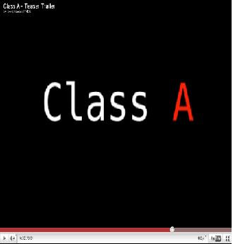
The title of our film appears in the middle of our teaser trailer. This is not conventional of a typical teaser trailer where the title of a film usually comes up at the end or at the start. We have have tried to be different by showing the title half way through. We felt this went well with the flow of the teaser and helped to break up two different scenes. The title of our film we thought carefully about. We chose the name Class A as it has connotations of drugs and the first scene in our teaser trailer is a drug deal therefore we thought this was effective and gives the audience an idea about what the film is about.
Title

The title of our film appears in the middle of our teaser trailer. This is not conventional of a typical teaser trailer where the title of a film usually comes up at the end or at the start. We have have tried to be different by showing the title half way through. We felt this went well with the flow of the teaser and helped to break up two different scenes. The title of our film we thought carefully about. We chose the name Class A as it has connotations of drugs and the first scene in our teaser trailer is a drug deal therefore we thought this was effective and gives the audience an idea about what the film is about.
Friday, 1 April 2011
Class A - Magazine front cover

This is our magazine front cover. At first we were thinking of doing an empire magazine front cover because it is well known within the media industry. We were finding it hard to emulate because we couldn't get the font to match up. So we decided to chose a magazine that was linked to our genre. Therefore we chose grime daily. We feel that the title goes well with the rest of the font and picture. The picture has also come out well which is good because it attracts the audience to it. We have included insides on other films such as shank and attack the block because they are both linked to our own film. We have tried to keep it quite basic so that the audience can visualise everything on the cover. The only thing that i would change to our magazine cover was the font of the title.
Tuesday, 29 March 2011
Class A - Poster
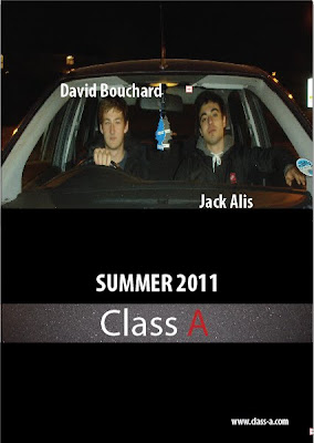
As you can see we have tried to keep our film poster as simple as possible. From the picture you can identify that the characters are located within a car, this will show to the audience that the film has some relation to the action genre. Also from the clothing they are wearing you can see that it can be related to black cinema/gangster genre. This is because they are wearing dark clothing such as hoodies and big coats. We have chosen the actors to be of a younger age as we feel it will attract the younger audience such as teenagers because this is the target audience of our film.
From the information showed you can see we have included the actors names which we feel are key as it will grab the audiences eye if they see a name they recognise. We have also included the name of the film and also the release date. Both are in quite bold letters to stand out to the audience. You can also see we have kept the same type of font and colour for the name of of the film. This is because we want each task to link together. From the red "A" it connotates that the film could involve blood and also be dangerous. This is the type of message we are trying to give off. There is also the website in the bottom corner which we feel is needed so that the audience can get extra information if needed. We decided to use dark colours as from our research other films within the same genre have similar colour types for example black, grey and navy.
The facial expressions of the actors is also key for creating an intimidating look. The audience are meant to look at this and feel quite afraid and worried. The shot is meant to seem quite intense so that it gives a message off to the audience about what the rest of the film is about.
Some of the things we are thinking of changing are trying to make it less block like and also include the phrase "keep your friends close but your enemies closer" as it appears with our magazine and we want to make a link between the two tasks.
Monday, 28 March 2011
Time management
Today we have finished editing our teaser trailer and have posted it on youtube and on our blogs. We are now producing our poster and magazine front cover.
Class A Teaser Trailer
We are happy with our final piece as we feel it is what we wanted to achieve. Things like the pace starting off slow and gradually increasing i feel have been done well. This is mainly because of the sound track we have used. i feel that the editing has been done well and is continous throughout. My favourite scene would have to be the chase scene as i think it flows very well and this is the first real part of when the trailer starts to speed up.
Some of the things i would have liked to of changed would be adding some differnet location as it would give the trailer a better effect. Some better quality footage for the montage such as better hand brake turns, wheel spins and burnouts.
We are thinking of adding some more intertiles or even just some bit of texts to inform the audience what is happening. This will improve the teaser trailer as these are some of the characteristics in modern teaser trailers.
Monday, 21 March 2011
Ancillery task ideas

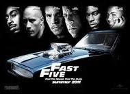
For our film poster we are think about having a quite dark feel to it. It will include colours such as black, grey and any other dark colours that would fit in. We are thinking of having a car in the background of the shot with maybe 4 actors standing in front of it. This will enable the audience to see who is starring in the film and it will give them a rough idea of what it is about. They will be able to tell by the clothes that the actors are wearing and the car will also show that it includes some action within it.
We have yet to decide what will be on the front of our Empire magazine cover. It will most likely be the same sort of thing with some actors being involved and a car will most definitely be used. With the car and the rough look of the actors it will so the audience that the film is of a hybrid genre.
Front cover magazine research
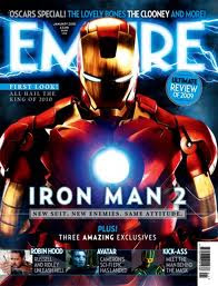
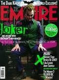
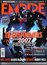
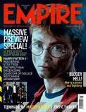
Here are some more examples of Empire Magazine front covers. As you can see the films advertised are all of different genres however the style and layout remains fairly similar. When making our front cover we need to incorporate a similar style and layout so that it looks realistic as a Empire Magazine front cover.
Friday, 18 March 2011
Time management
Yesterday we filmed the rest of our teaser trailer which included our montage. It all went to plan because the weather was ideal which helped us when needing to film the hand brake turn and wheel spins.
Today we captured the scenes and put them onto Adobe Premier Elements where we started editing the whole teaser trailer together. We have finished the editing now and just need to choose the right music needed to go with the trailer. We are finding it hard at the moment to find some music that will fit in with our teaser trailer. We feel that there is a good examples of continuity editing. For example during the car chase it looks very realistic, this is because it has been edited together well and flows continuously. The intertiles have also been put in and this adds to the teaser trailer making it more realistic.
Today we captured the scenes and put them onto Adobe Premier Elements where we started editing the whole teaser trailer together. We have finished the editing now and just need to choose the right music needed to go with the trailer. We are finding it hard at the moment to find some music that will fit in with our teaser trailer. We feel that there is a good examples of continuity editing. For example during the car chase it looks very realistic, this is because it has been edited together well and flows continuously. The intertiles have also been put in and this adds to the teaser trailer making it more realistic.
Tuesday, 15 March 2011
Magazine front cover research
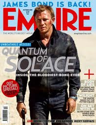
Here is an example of a front cover of one of the issues of Empire. The film advertised on the front is Quantum of Solace. When making our front cover of a magazine we need to consider things like:
- framing of images
- font types
- font colours
- background colours
- positioning of images and text
- language
Like our film Quantum of Solace is of the action genre. However its is portrayed in a different way to what ours will be. The front cover of empire in this issue uses light colours like grey, white, pale blue etc. In our front cover we want to advertise our film in a more darker way by using colours like black and dark grey. This is because our film is a hybrid genre of action and teenage gangster, therefore the use of colour is extremely important. We will be looking to use similar fonts as the ones used in this front cover as they are clear and stand out. It is very important to make the text stand out to grab the readers attention to pick up the magazine and buy it. It also grabs their attention to focus on the film being advertised.
A large image of Daniel Craig is placed in the centre of tne magazine cover. They are using the image of actor Daniel Craig to help advertise the film as he is a popular and famous figure. This is something we could focus on by using images of actors as the main focus.
Monday, 7 March 2011
Poster Ideas
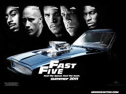 This is a poster for Fast Five. Fast Five is of a similar genre to our film. The poster draws the audience attention through the clear images of the actors. The images of the actors stand out in the black background. It also creates a sense of mystery. The genre of this film is clearly established as the blue car is the centre piece of the poster. It immidiatley indicates to the audience that this is going to be an action film without releasing much information. The only information that is shown is the name of the film, actors names and the realease date.
In our poster we be looking to do a similar thing. We want to establish the genre of the film without releasing too much information. We need to use colour and images effectively to represent are genre clearly.
Wednesday, 16 February 2011
Time management
We are thinking of doing our montage filming during February half term, this is because this when all the actors are available and it is easier because everyone will have more time. This is the last bit of filming that we need to do for our teaser trailer. We have recently edited together the scenes of the trailer without putting in the intertitles. We have done this because we wanted to see whether the footage we created was up to the right quality. We feel this has benefited us because it has given us a good insight to what our teaser trailer will look like. Once the montage has been filmed we will edit it all together including the intertitles to see what the final copy will look like.
Sunday, 13 February 2011
Music ideas
Here are some instrumentals that we feel will fit in with our teaser trailer. We feel they link well with genre with it being teenage crime as this is stereotypically what teenage gangsters listen to. The pace of each instrumental is also key as this is what will make the footage all link together. Most of them seem to start off slow with them picking up pace later on. This is what we are looking for in our teaser trailer. This is because we are wanting to set the scene early on with the pace being slow, it will then go to a montage which is where it picks up in pace.
Ideas for Music
This song is the theme tune from the film from Adulthood. Adulthood, like our teaser trailer is of a similar genre. It deals with teenage crime and deals with the issues relating to it. This type of music is similar to what we would like in ours. However, it will be difficult to find music like this as we have to use non-copyright music. However we will try to find music of this type to fit in our teaser trailer to make it more effective and of a higher quality.
Animatic
This is our animatic of our teaser trailer. We have created this to show the scenes in our teaser trailer and roughly how long they will be. It is more interactive than a storyboard and shows the scenes more clearly. The pictures are noy of a high quality however you still can understand them and gain an idea about the sequences of the scenes.
Friday, 11 February 2011
Time Management
Today we filmed the scenes again in our teaser trailer. We managed to film all the scenes accept for our montage of quick scenes at the end. We decided to redo these scenes, because after we filmed it we realised that there were a few mistakes made. The footage was fairly shaky in certain scenes so we decided to do all the scenes again to improve the quality of our teaser trailer.
We chose to do our filming today because the conditions were perfect for filming. It was a clear night with no rain whatsoever. The car park we were using was fairly empty, therefore we were able to film without any interruptions.
We chose to do our filming today because the conditions were perfect for filming. It was a clear night with no rain whatsoever. The car park we were using was fairly empty, therefore we were able to film without any interruptions.
Friday, 28 January 2011
Name of film
Today we came up with a name for our film. We are going to call it Class A. We feel that this title is appropriate for our film as the story line is a drug deal that has gone wrong and therefore Class A mixes in well with this genre. Class A is also linked with the drug dealers with them being the best around. The reason why the "A" is in red is because it will make it stand out amongst others and therefore get the audiences attention. The colour red is also symbolised as being dangerous which what our teaser trailer is about. The "A" is most likely to be bold so that emphasis is on it. The font will be nothing fancy because we want it to be hard hitting towards the audience.
Friday, 21 January 2011
Production Company
Tuesday, 18 January 2011
Saturday, 15 January 2011
Evaluation of Questionnaire
From our questionnaire we have found out that Males tend to enjoy the action films because of the fast paced editing and the tension that goes with it. The younger generation are also more interested in action films and also sci fi's. This is because they can relate to the films due to the modern day technology such as xbox and other things like that. The younger audience tend to go to the cinema to watch films, this is because they want to get the full atmosphere of the film. The older audience prefer to watch films at home because they like the comfort of their own surroundings. From the findings we have also found out that younger people prefer to watch teaser trailers before going to see the film because with them having little amount of income they don't want to waste it. This means that we need to make our trailer as appealing as possible so that it gets the attention from the target audience.
Friday, 14 January 2011
Responses to questionnaire
We gave this questionnaire to five randomly selected people in different age categories. These are the answers they gave....
Person 1
1. Male
2. 0-12
3. Action
4. I like this because I enjoy watching shooting with lots action
5. DVD
6. No
7. N/A
Person 2
1. Female
2. 60+
3. Romantic
4. I enjoy watching romantic because it is light hearted and reminds me of when I was younger
5. SKYmovies
6. No
7. N/A
Person 3
1. Female
3. 26-40
3. Comedy/Romance
4. I enjoy a love story with some elements of comedy to make me laugh
5. SKYmovies
6. No
7. N/A
Person 4
1. Male
2. 13-25
3. Action
4. I enjoy this type of film because it is fast paced and relates to computer games like call of duty which I enjoy
5. Cinema
6. Yes
7. Yes
Person 5
1. Male
2. 40-60
3. Sci-fi
4. They are usually unrealistic this helps to take the stress away from every day life
5. DVD
6. No
7. N/A
From these results it is evident that teenagers are most likely to watch teaaser trailers. This is useful are target audience are teenagers and young adults.
Questionnaire?
1. Male or female?
2. Age?
0-12 13-25 26-40 41-60 60+
3. Favourite film genre?
Horror Action Comedy Romance Adventure Sci-fi Thriller
4. With reference to question 3 why did you choose that Genre?
...........................................................
5. How do you consume films?
Cinema Internet DVD SKYmovies Other
6. Do you watch trailers?
Yes or No?
7. If yes,does a teaser trailer affect your decision to watch a film?
Yes or No?
Intertitles
The plan for our teaser trailer is to have quick scenes between inter titles which tell the audience important information about the film, for example title of the film, main actors, release date etc. We are thinking to have quick edited scenes followed by a black background with inter titles coming up. We have researched other teaser trailers and some of the best have followed this idea. We think that this will benefit our trailer and overall make it more appealing to the target audience.
The intertitles will flash up inbetween seens on a black background. They will be bold so that the audience pays close attention to it and can process the information
The intertitles will flash up inbetween seens on a black background. They will be bold so that the audience pays close attention to it and can process the information
Update on filming
Last week we decided to film part of the teaser trailer. We have filmed the first couple of scenes but we may have to re do some of them to make them more realistic and authentic. We also decided to change the location of the trailer, our first ideas were to film at young street car park which is a gravel car park. We decided to change it because the car park was waterlogged and it was difficult to film on. We moved the location to a train station car park as it is a lot easier to film and in actual fact is it probably better overall. Also we have more actors than we first planned and also more cars. We have gone from three actors to six actors and two cars to three cars. I feel making these changes are going to benefit our teaser trailer and make it better.
Costume ideas
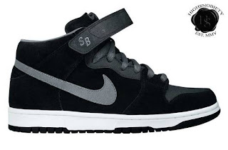
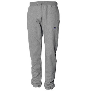
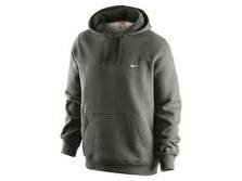
This is an idea of what the actors will be wearing in our teaser trailer. They will be wearing teenage gangster clothing like joggers, hoodies and trainers etc .... We got these costume ideas from films like Kidulthood were teenage gangsters are used. We feel that are target audience which will be mostly teenagers will be able to relate to these costumes as it is fairly common and fashionable in modern times.
The mise-en-scene in this case the costumes is crucial as it portrays certain stereotypes to the audience which immediately portray the character and personality of the actors. For example one of the main actors Jack will be wearing trackies and a hoodie. This immediately gets the audience thinking about teenage crime and issues related to that as it is a common stereotype in modern day society.
The mise-en-scene in this case the costumes is crucial as it portrays certain stereotypes to the audience which immediately portray the character and personality of the actors. For example one of the main actors Jack will be wearing trackies and a hoodie. This immediately gets the audience thinking about teenage crime and issues related to that as it is a common stereotype in modern day society.
Tuesday, 4 January 2011
Audience Profiling - Fast and Furious
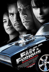
Fast and Furious
release date: 10th April 2009
price: C+
estimated box office: £6,000,000
genre(s): Action
director(s): Chris Morgan
film cast: Vin Diesel, Paul Walker, Michelle Rodriguez, Jordana Brewster
certificate: 12A
distributor: Universal Pictures
release date: 10th April 2009
price: C+
estimated box office: £6,000,000
genre(s): Action
director(s): Chris Morgan
film cast: Vin Diesel, Paul Walker, Michelle Rodriguez, Jordana Brewster
certificate: 12A
distributor: Universal Pictures
Here you can see a table that shows the type of audience that went Fast and Furious. Like our film Fast and Furious includes car chases and is of the action genre. 74% of the audience for this film is in the age category between 15-24 years of age. This shows we need to target our film at people in this age category. The gender analysis shows that 74% of the audience for this film was males.
These stats suggest that are teaser trailer should be aimed at young males. We plan to do this by including lots of action, by using fast editing techniques.
Wednesday, 15 December 2010
Kidulthood trailer analysis
Kidulthood has had a major impact on our change in genre decision. It is a film the deals with the issues that revolve around teenage crime. The trailer uses dark lighting mostly to indicate to the audience what the genre of the film. The major thing we have learnt from watching Kidulthood is the costume and the type of actors they have used. For example I feel the actor Adam Deacon is crucial in helping to sell the film.
We will be looking to include things based on from watching the trailer:
- The use of costume
- Dark lighting
- Fast paced editing
- Type of music
- Camera angles and composition
- Settings and location ideas
This is a trailer and we are producing a teaser trailer so we are going to try and use even faster editing and include more intertitles. We have also decided not to use dialogue unlike this trailer as we want the audience to focus on our diagetic and non-diagetic sound.
Tuesday, 14 December 2010
Improved shot list
Shot 1: This is an establishing shot of the a car entering the car park, the camera also pans around at the same time. We used this shot so that the audience could get an idea of the location, it also gives them an idea of what type of genre it will be.
Shot 2: The camera then fades and goes into another scene. We used an over the shoulder long shot to show our first glimpse of the actors. The long shot was used because we didn't want to go straight into introducing the characters.
Intertitle
Shot 3: Medium shot of all the actors together, this is first time that the audience see all 3 actors. The camera then zooms in to allow the audience to see what the actors are doing.
Shot 4: Over the shoulder close up shot of another actor in the car. This has been used to show the emotions of that character. While this is happening the fight is still going on in the background.
Shot 5: Long shot of the car chase beginning. The camera also pans round when the cars go past.
Shot 6: Long shot the cars coming towards the camera. I think this is a good shot because it feels like the cars are coming straight towards the camera.
Shot 7: Long shot of the coming past. This is a good shot because it show the audience how fast the car going. It builds tension within the trailer.
Intertitle
Shot 8: Medium shot of a car doing a wheel spin.This is the start of a montage so the shots are quite quick to keep the audience on the edge of their seats.
Shot 9: Medium shot of a cars wheels screeching, this makes the audience feel like someone is following him.
Shot 10: Close up of the radio playing, it is a song that is associated with teenagers.
Shot 11: Long shot of a car speeding in a certain location
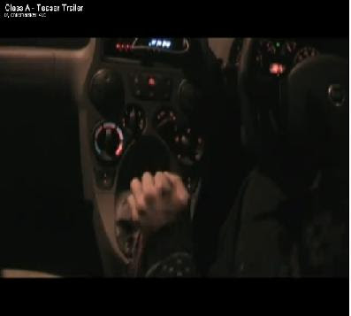
Shot 12: Close up of a gear change, this is a good shot because it allows the audience to see what is happening within the car. It is also adds a bit of difference from all the shots being outside the car.
Shot 13: Medium shot of the car coming out of a hand brake turn. These shots are meant to be quick so that it keeps the tension high.
Intertitle
Audience Profiling

As you can see from the table below the highest precentage of people that go to the cinema in the UK are people in the age 15-24 age category. We therefore have decided to aim our teaser trailer at people in this age category so we have a larger target audience.
We will need to make sure our teaser trailer includes the appropriate style and narrative to attract this particular audience. We will need to make sure our storyline is contemporary and relevant in modern society which I feel are's is. We have chosen teenage actors so that it appeals to a fairly youthful audience. We are going to try and find suitable music to use that is contemporary, again to attract our target audience.
Actors
Actors
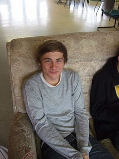
This is Louis. He is playing one of the drivers in our teaser trailer. He is in the film therefore needs to wear suitable clothing so that the mise-en-scene looks realistic and professional. We feel he is suitable to play the role of the driver that is being chased because he looks like he can be easily intimidated therefore creating realism for the audience.
Shot List
Long shot of when when the car pulls into the car park
Over the shoulder shot of buyer getting out of his car
Over the shoulder shot of the dealers walking towards the buyer
Meduim shot of the buyer handing the money over and the dealer giving him the drugs
Medium shot of one of the dealers throwing a punch towards the buyer
Over the shoulder shot of the buyer in the car racing away
Establishing shot of the dealer chasing the the buyer
Panning shot of the cars racing out of the car park
Long of the cars racing down the ramp
Side on still shot of the cars going past
Montage of hand brakes, wheel spins and characters emotions, these will be filmed using close ups to emphasise the scene.
What we have based our actors on - Adam Deacon
 This is Adam Deacon who has featured in various teenage crime films such as Kidulthood, Adulthood and Anuvahood. All these films we researched to find out the characteristics of that genre. We have tried to emulate his clothing within our own trailer. We have done this by making our actors wear typical clothing such as joggers, hoodies and nike trainers for example. All these pieces of clothing will be quite dark because people within that situation want to stay undercover and not draw attention to themselves. He is the perfect actor to base our own actors upon, this is because he is well known within the industry.
Reasons for not having a Script
We have decided not do do a script for our teaser trailer as there will be no dialogue or voiceovers. Most teaser trailers do have some dialogue however we felt that it was not necessary in ours. We have put our focus into other aspects of sound like diagetic sound and non-diagetic sound.
We want to use a variety of natural diagetic sound like the sound of tyres screeching for example. We feel this will indicate genre and narrative to the audience just as effectively as dialogue would. We also feel that non-diagetic sound (background music) is also an effective way of revealing narrative and genre. We want our teaser trailer to be unique in this way therefore we felt there is no need to produce a script.
We want to use a variety of natural diagetic sound like the sound of tyres screeching for example. We feel this will indicate genre and narrative to the audience just as effectively as dialogue would. We also feel that non-diagetic sound (background music) is also an effective way of revealing narrative and genre. We want our teaser trailer to be unique in this way therefore we felt there is no need to produce a script.
Props
4.3.2.1 Audience Profiling

From these results you can see that their target audience are mostly young adults aged between 15-34 . 56% of the audience are males. This shows that this film mainly appeals to males. This film is of a similar genre to ours and we will be trying to aim at this particular type of audience between the age of 15 and 34. We are also aiming at males mostly.
Subscribe to:
Comments (Atom)
