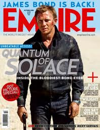
Here is an example of a front cover of one of the issues of Empire. The film advertised on the front is Quantum of Solace. When making our front cover of a magazine we need to consider things like:
- framing of images
- font types
- font colours
- background colours
- positioning of images and text
- language
Like our film Quantum of Solace is of the action genre. However its is portrayed in a different way to what ours will be. The front cover of empire in this issue uses light colours like grey, white, pale blue etc. In our front cover we want to advertise our film in a more darker way by using colours like black and dark grey. This is because our film is a hybrid genre of action and teenage gangster, therefore the use of colour is extremely important. We will be looking to use similar fonts as the ones used in this front cover as they are clear and stand out. It is very important to make the text stand out to grab the readers attention to pick up the magazine and buy it. It also grabs their attention to focus on the film being advertised.
A large image of Daniel Craig is placed in the centre of tne magazine cover. They are using the image of actor Daniel Craig to help advertise the film as he is a popular and famous figure. This is something we could focus on by using images of actors as the main focus.
No comments:
Post a Comment